
VISUAL IDENTITY SYSTEM
Welcome to an enigmatic world of our own imagining. Our studio is represented by a timeless aesthetic created through a craftsman’s hands with a dreamer’s vision. This visual identity system overflows with ambiguous details; characters in a narrative where everything is designed to represent something.
Client: The Brand Movement

T-B-M
The ‘B’ is a combination of three letterforms contained within a single shape and delineated by two symmetrical negative spaces. The result is a simple but significant foundation for the entirety of our visual identity system.
/ logo /


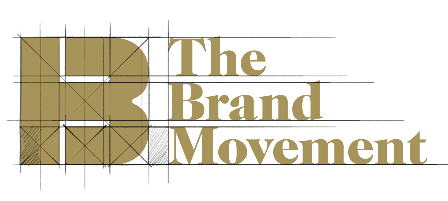
WORDMARK
The geometric harmony of this exercise in precision establishes a unique gestalt; the grid based construction prioritizes balance, symmetry and communicative function.


Constructed to scale.
